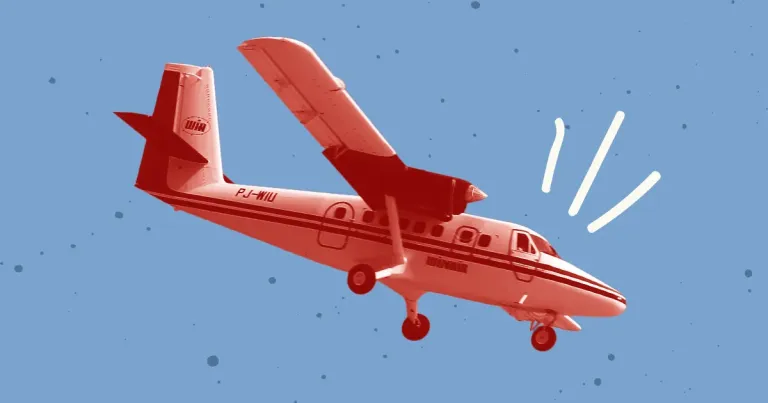
Best Practices for HTML Background Video Optimization
Background videos are a website staple and can make a positive impact on users, but are often not fully optimized. This post covers the main aspects of optimizing background videos.

If you’re a developer, chances are you’ve dealt with footers at some point in your career. Getting them to stick to the bottom of the page can be problematic, especially on pages with sparse content.
Ryan Fait’s sticky footer is the traditional way to solve this problem. This method has served many web developers (myself included) over the years with minimal issues. The only drawback is that it requires a fixed height to function properly.
Fixed pixel-based heights can make updating content needlessly time consuming, especially when we're dealing with different footer sizes on tablet and mobile screens. And what if a client needs the ability to add and remove content dynamically through the CMS? Fixed heights can make that task next to impossible.
Flexbox provides a modern solution that will allow us to create a footer with variable height by wrapping it inside a flex container. The best part? Even if your site is already using the traditional sticky footer method, you only need a few extra lines of CSS to make it work.
<body class="site">
  <header>...</header>
  <div class="wrapper">...</div>
  <footer>...</footer>
</body>
The markup here is nothing out of the ordinary. The only thing that stands out is the class on the body. We'll be using that as our flex container. If you'd rather not use the body element, you can wrap your content in another block element like a div or a main instead. Either way is fine.
display: flex is used to establish this element as a flex container. flex-direction determines the axis (row for horizontal and column for vertical.) In our case, we'll be using column to fill the space from top to bottom.
.site {
  display: flex;
  flex-direction: column;
  min-height: 100vh;
}
Once the container is in place, we can have our wrapper div expand to fill the available space. This is what keeps the footer at the bottom of the page, regardless of the page's content.
.wrapper {
  flex:1;
}
And that's all there is to it! Now you can add content to your footer and watch it expand accordingly. It will always stay at the bottom of your page, and you never need to worry about adjusting the height.
Need to get more comfortable with flexbox before integrating it into your own sites? We recommend Flexbox Froggy - A game for learning CSS flexbox. This is a great way to get more hands-on experience before diving in on an actual site.
Background videos are a website staple and can make a positive impact on users, but are often not fully optimized. This post covers the main aspects of optimizing background videos.
Here's how we converted our own site from Foundation to Tailwind, along with a cheat sheet to help you do the same.
Overall website performance has always been important but after Google's Page Experience updates in 2021, it's more important than ever. Improving your site's Core Web Vitals can drastically improve the page experience for your site visitors.
We respond within one business day and will tell you honestly whether we're the right fit.
Schedule a Call